Virteggi Fine Chocolate Case Study
Project description
Brand identity project for Virteggi fine chocolate. Logo design, product and packaging design, promotional material design, branding strategy - Work in progress.
Details
- Branding strategy
- Logo concept and design
- Brand identity package
- Product design
- Packaging design
- Marketing and advertising
Identity
For the general look of the new identity, the intent is to communicate a balanced mix of tradition and modernity. I have used therefore a very simple & clean, minimalistic and classy look with 3 elegant colors like white, black and purple.
Colors
Rich black: C 75%, M 68%, Y 67%, K 90% - R 6, G 8, B 8, - #060808
White: C 0%, M 68%, Y 0%, K 0%- R 255, G 255, B 255 - #FFFFFF
Purple: C 20%, M 100%, Y 0%, K 17% - R 170, G 0, B 212 - #AA00D4

Typography

In the line of mixing tradition with modernity, I have chosen a black letter font like Germania, reminiscent of the more famous Fraktur, to communicate the traditional side of the company with a strong, thick typeface, suitable for the logo and the company description, as well as for the names of the products. Germania is not particularly elaborate and fancy so it ensures readability for short text with a touch of old-school, retro vibe suitable for a craft chocolate maker. This is counterbalanced by the use of a more modern sans-serif typeface like Montserrat, used for payoffs and long copy. A thinner, lighter, more modern font.

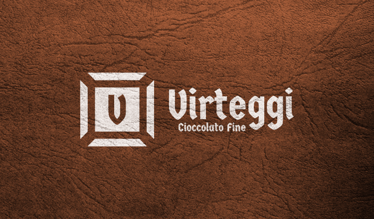
Logo
The idea comes from a square of a traditional block of chocolate, stylized and turned into an identity symbol through the use of the V initial. Simple and efficient, immediate and effective. Right to the point: this is a chocolate maker.
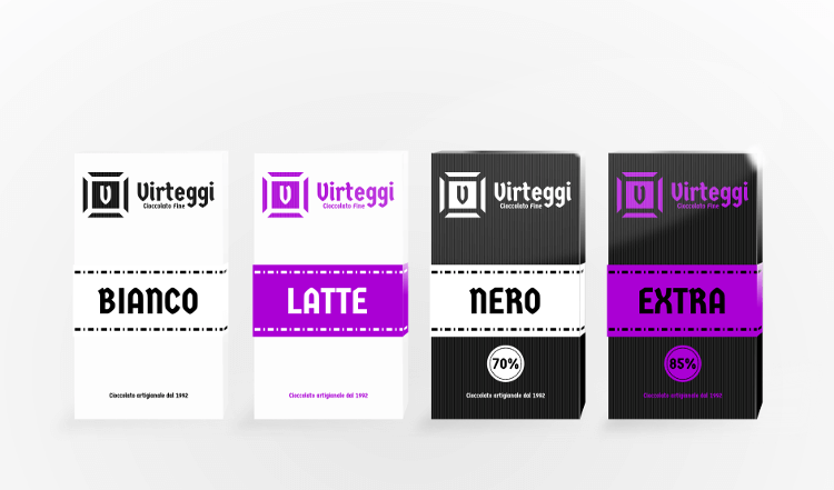
Product Packaging Design
Virteggi offers fine craft chocolate in four kinds - white chocolate, milk chocolate, dark chocolate and extra dark chocolate, declined in a series of different products: classic chocolate bars, small round chocolates (only for milk and dark chocolate), mixed square chocolates (white+milk and milk+dark), rectangular chocolates (only for dark and extra dark).

This is a quick way to see how the product line will appear. From left to right: white chocolate, milk chocolate, dark chocolate - 70% cocoa, extra dark chocolate - 85% cocoa content. As for the general look of the new identity, the intent is to communicate a balanced mix of tradition and modernity through the use of using a very simple & clean, minimalistic and classy look using white, black and purple, simple textured matte paper with a glossy paper strip with the name product - itself easy and direct - written in uppercase letters using the same typeface of the company logo: Germania One. No picture, no extra text, just the essential info and a gradual stylish upgrade from the white chocolate (all-white look, the product itself is called "Bianco", that is "White", to the extra dark variant in black & purple. Montserrat, the sans-serif font, is used instead for the payoff: "Delicious has a new name."

